

The app that empowers women to travel safely on their own.
Duration
8 weeks
Tools
Figma


My role
UX / UI designer
What is Wher?
Every woman has the right to travel freely and with confidence, and Wher is designed to provide just that. Wher encourages women to explore the world in a safe and meaningful way. Women can share their travel itineraries and experiences whilst also being able to alert others to any safety issues.
Design process

Discover
Research | Interviews | Affinity Map
Define
Persona | Experience map | User stories | Task flow

Develop
Initial sketches | Wireframes | User testing | Branding | UI Library

Deliver
High fidelity | Multi platform | Marketing website
Discover
Secondary research
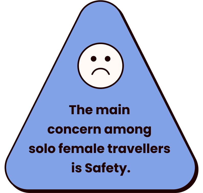
Studies show that the main concern among solo female travellers is safety. One of the many causes of these concerns is that women are told more often to worry about their safety when travelling. Main stream news articles often talk about women travelling alone but usually only highlight the negatives. By comparing the landscape of mainstream media stories reporting solo female travellers against the statistics I was able to gain a rich understanding of my problem space.


Identifying the Problem
73% of travel agents agree that women are more likely to travel solo than men. However, studies show that the main concern among solo female travellers is safety. One of the many causes of these concerns is that women are told more often to worry about their safety when travelling. Of 1000 travellers asked on travel-focused facebook groups, 69% of female respondents reported being told they’d get raped if they traveled solo vs. 6.6% of men, which makes women very conscious about their safety when travelling alone.

Digging deeper
To learn more about the common behaviours, motivations and pain points of solo female travellers, I conducted interviews with women who had travelled solo and those that want to but hadn’t yet. Comparing both ensured that I could identify what was preventing women from going whilst also finding out what the benefits and difficulties faced when travelling alone.
Affinity mapping: identifying key themes
#1 Safety
Women and those who identify within the LGBTQ+ community are more likely to feel unsafe when travelling.
“Being a woman on your own and being around men that you don't know can be a bit disconcerting.”
“I am part of the queer community and have many friends that have lots of worries for their safety too.”
“Being female and alone also warrants unsolicited attention from males which can be scary especially at night or on public transport”
#2 Overall experience
Travelling on your own allows women to feel liberated and empowered by the experience of independence.
“Don’t let the fact that you don’t have anyone else to go with hold you back. You'll still have a great time.”
“I had a sense of liberation, I really like forcing myself out of my comfort zone, to experience things like eating alone felt very empowering.”
“Travelling on my own was a way to solidify my new found independence. “
#3 Planning
Doing lots of research of the area before visiting a new place is the best way for travellers to feel safer when going alone.
“I go to places where I have heard good reviews from other people - these are most important to me as you have first hand advice.”
“I would advise people to learn about the culture before travelling somewhere and know how to behave so that you avoid any conflict.”
“I think I could have avoided being scammed by just doing some research and being a bit more aware.”
My user interviews outlined that doing plenty of research before visiting a new place, and having a solid plan with recommendations from friends, family and reviews online allows women to feel more confident and safer when travelling alone.

How might we help women create safer travel plans so that they feel confident when travelling alone?

Define
User Persona
After exploring my problem space, identified my problem statement and a HMW question I was able combine all of my findings to define a persona that represents the core insights of my target users.

User Experience Map
To gain a deeper understanding of my users needs I developed an experience map to identify a holistic view of the next steps they would take to plan their solo travel. This helped me recognise what expectations, behaviours, pain points and challenges users might experience and give me insights into what opportunities there were for improving their experience.
The current user experience map indicates areas for intervention as being: Searching for recommendations and identifying that they are safe.

The digital solution
I brainstormed digital solutions for my product using the crazy 8 method and based on the time frame that I had to create my product, narrowed down my solutions to the following:

Sharing experiences

Staying in touch

Alerting safety issues

Planning the trip
Task selection
By authoring a set of user stories I was able to develop a deeper understanding of their goals and motivations. I grouped my user stories into 4 key epics and themes, then picked one that had the most value to develop into my task flows.
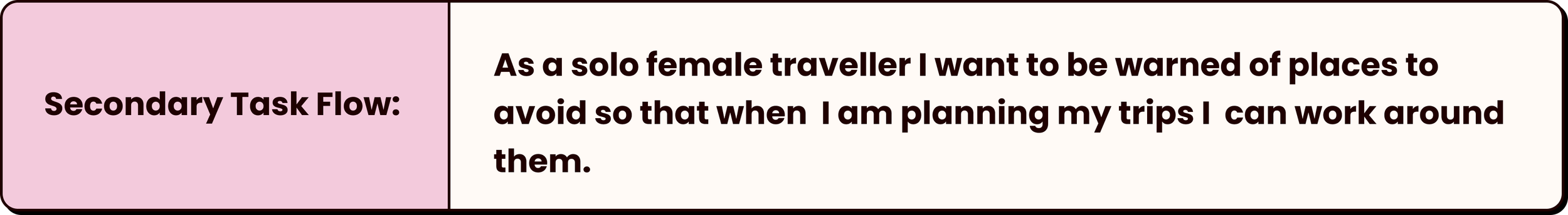
Focused task: Planning the trip
In order for me to illustrate how safety would be taken into consideration within planning a trip it was essential to create a secondary task flow that would highlight this.


Task flow explained: Sam has began planning her trip to Japan using the itinerary function on the app. She has not added many items to her itinerary yet, and wants to look for some inspiration using the ‘explore’ function. She looks at Emma’s itinerary and chooses to add the Ghibli Museum attraction to her own itinerary.

Task flow explained: Sam notices that Emma has alerted a safety issue with the bus trip featured on her itinerary. Sam gets in touch with Emma and asks for if she has any alternative advice.

Develop
Initial Sketches
To visualise my product and how it would function I began by sketching the screens that would need to be developed to complete the chosen task flows.
I chose not to sketch chat screens as I wanted Wher’s messenger function to be the same as IOS’s interface - making it easier for users to navigate.


Wireframes and user Testing
The next stage was to refine these sketches into greyscale wireframes and test them out on 2 rounds of 5 users - applying amendments where needed between both tests before developing the visual identity of the product.


Crafting the Visual identity
Now I had identified my digital solutions, I created clear brand guidelines for Wher - making sure that each design decision was made with my user in mind.
The brand name Wher evolved from a combination of the words ‘Where’ and ‘her’ - emphasis on the ‘her’ as the brand is aimed at women.

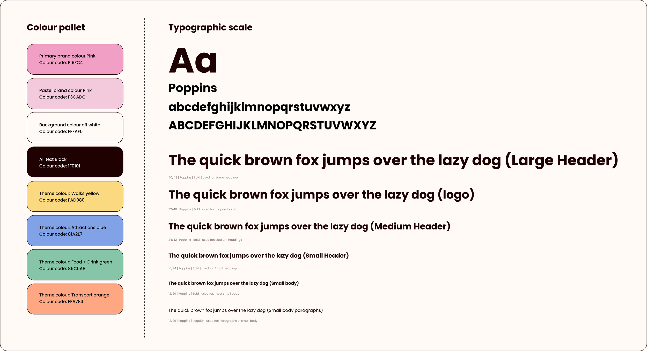
Colour evolution
I initially chose to focus on bold bright colours for Wher based on the look and feel of my moodboard, however after much consideration found that I wanted to push for a fresher, softer feel to my brand. Colour is very important to me, and with this in mind I experimented and came to the decision to lighten my pop colours by 50%. Coincidentally, this change also meant that the branding became more accessible, something I wanted to ensure was taken into consideration when creating Wher.
It was important for me to create a strong visual identity consisting of a range of colours, bold fonts, icons and chunky retro buttons. Wher’s interface should evoke feelings of joy and playfulness to its users.


UI library
I set out to design a library of elements and reusable design components to ensure a design system that would work well as a guideline for developers and other UX/UI designers. I crafted multiple icons, buttons, chips and cards that would be used throughout the app and the desktop product.
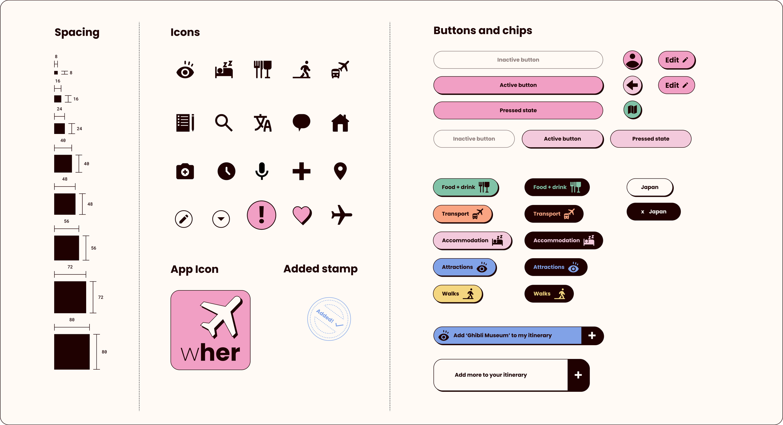


Championing safety
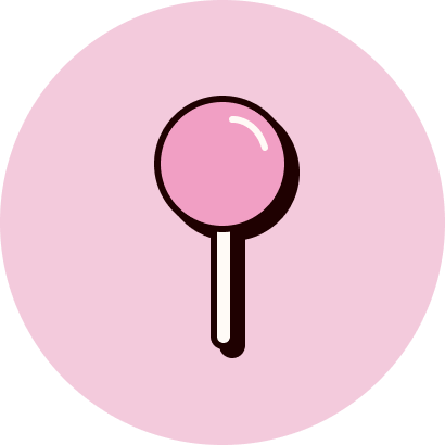
One challenge of this project was to identify how I could inject the safety aspect into Wher. I created an icon that would be used within the Wher itinerary cards which help users identify where travellers had experienced any safety issues they may have encountered and avoid those places.

Designing for travel
To make sure that the visual identity of this product really reflected the theme of travel, I created a set of travel stamps inspired by some visuals from my moodboard. I also applied this stamp style to an ‘added’ stamp featured when a user adds an item to their itinerary.


Deliver

for mobile
Wher for mobile is designed for travellers on the go. The app allows travellers to conveniently check their itinerary, connect with others, get inspired, translate and much more.

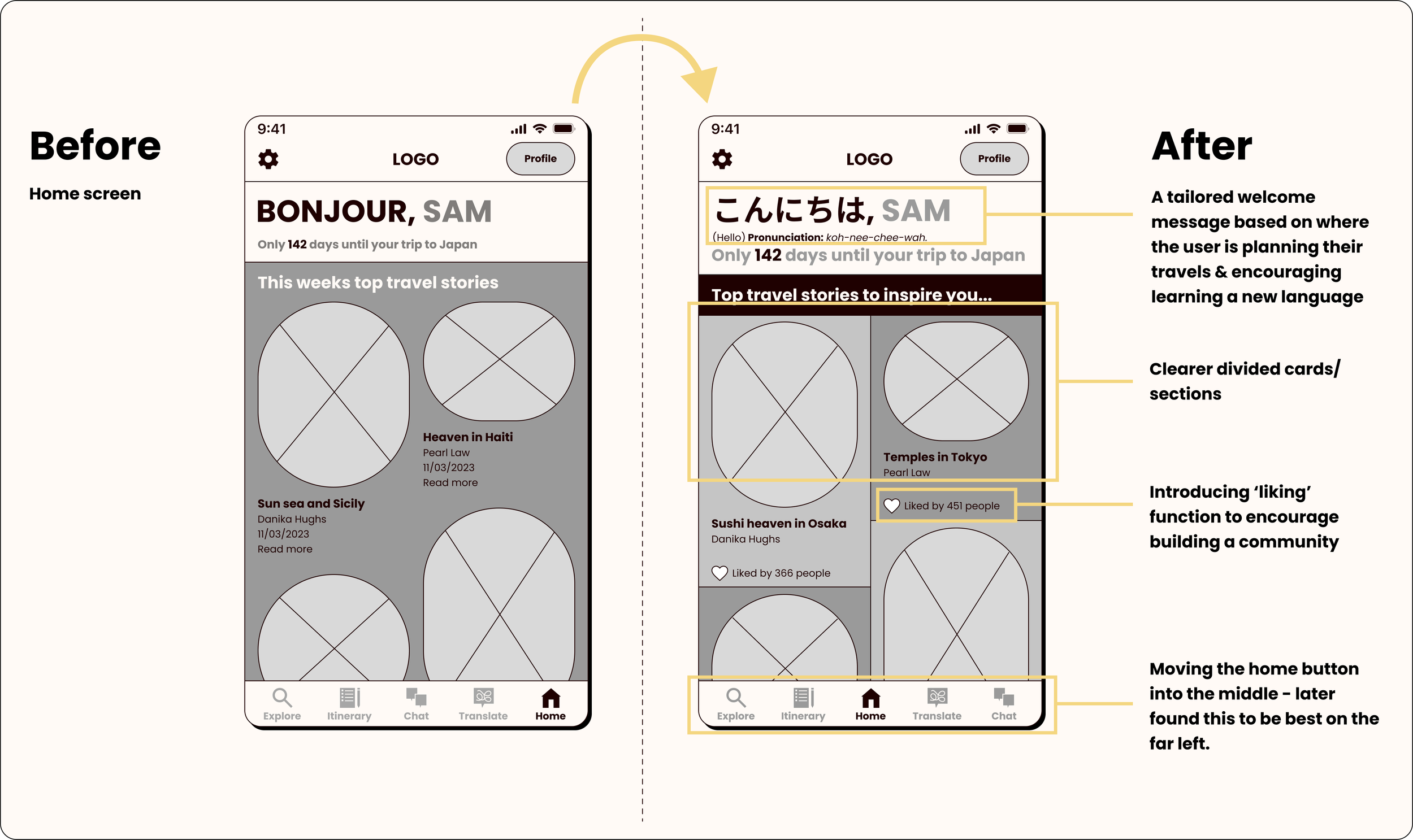
Welcome
Wher welcomes users with a tailored home screen. Count down the days until you go on your trip, get inspired by travel stories based on search history and start learning how to say hello in a new language.

Explore
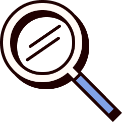
With Wher you can search for itineraries created by others in the community. Simply enter a location and find others that have travelled to your chosen destination.

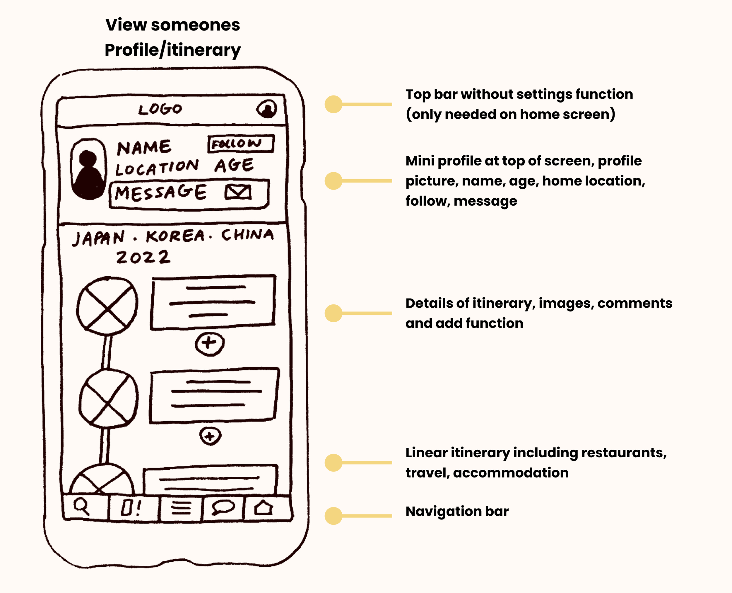
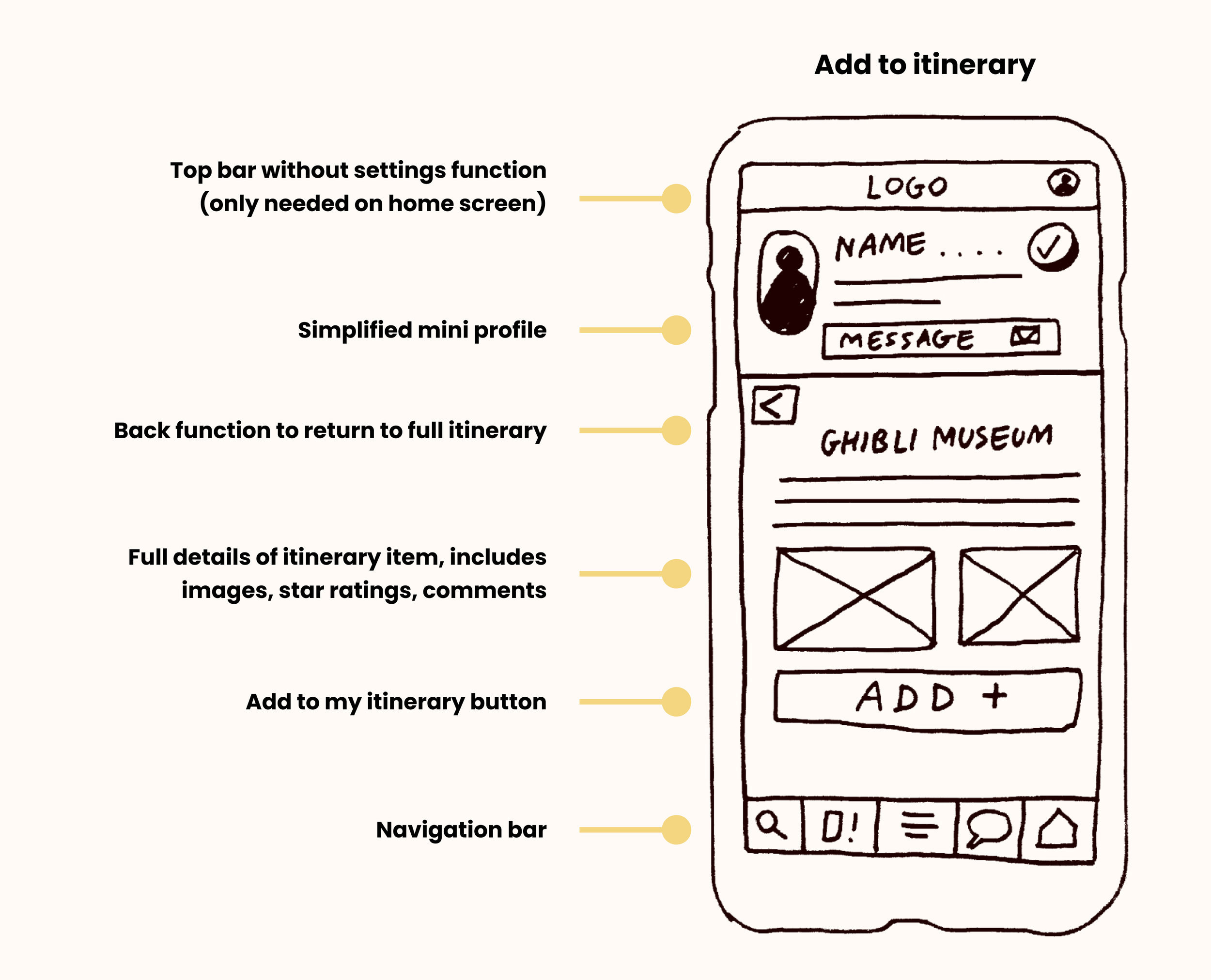
View others itineraries
Get inspired by other travellers itineraries and add their items to your own travel plans!

Chat
With Wher you can get in touch with fellow solo female travellers. Ask others about their experiences, get advice and make friends.

Create your itinerary
Carefully craft your own travel itineraries. Chose safe places to visit and become empowered by the beauty of travelling all by yourself.
for desktop
To explore the full potential of Wher as a product it was valuable to create a version of the search function within a desktop setting. Users would be most likely to use the desktop function when searching for inspiration and creating their own travel plans. The extra space that comes with being a desktop allows users to view where places are on a larger scale map.
Product marketing website
In order for Wher to build a community of empowered female travellers it is essential to have a strong product landing page. The landing page explains the multiple functions of Wher, displays customer reviews to gain trust, and has multiple call to actions.
Key takeaways
Wher has been a passion project for me, developing something close to my heart and inspired by my own feelings towards becoming a stronger and more independent woman. My extensive research, including user interviews and usability tests, helped me to understand the needs of solo female travellers and identify pain points. I’ve gained a deeper understanding of the needs, fears, and concerns of solo female travellers and learnt how to design to empower women whilst also keeping their safety at the forefront of the process.
